Our clients knew walking into this character filled 1900’s home that it was perfect for them! The only problem was that it was a major fixer upper and was going to require a lot of elbow grease to make it their dream home. They had already tackled some of the 2nd floor projects themselves but decided to call in professionals for the task of transforming the main living space.
When we first met these homeowners they showed us all the things that they wanted to fix and their budget didn’t align with the cost of their wish list. They knew they didn’t want to settle with only having some work done so they decided to wait until they could save up the funds to start transforming their fixer upper into their forever home. To see our initial walk-through of this project and talking with our clients about their renovation budget, check this video out!
PROJECT AT A GLANCE:
Location: Wakefield, MA
Type of Home: New England Colonial Built In 1900
Square Footage: 1,524 Square Feet
THE WISH LIST: Our clients wanted to remain true to some of the original character of the home but wanted to give it a fresh modern look. A classic white kitchen with some pops of color was a dream of our clients and we can’t forget the ever so popular fixer upper farmhouse sink! We needed to create space for a mudroom, a half bath and laundry, a kitchen design with an island that had seating, properly placed appliances (some hidden away if possible!) and create a functional dining room that they could entertain in. Our client also loved a touch of modern style so she was really interested in incorporating some fun lighting!
THE ENTRY BEFORE: This foyer was sporting dated wood paneling and vinyl flooring. Even though the front entry needed a fresh new look, there was still a lot of character that we wanted to preserve like the stairway and the wooden front door.

THE ENTRY AFTER: This foyer went from outdated and drab to the perfect mix of modern and traditional style! We kept the paint color neutral and simply added some detailed moldings to the window and door trim for some interest. The matte black cage lighting was the best way to finish off this fresh new look!
![]()
BEFORE: Entering the kitchen was a true blast from the past with the checkered floors and walls! The issues with the old kitchen design were too many to count! They even had a movable cart to hold their microwave and they had to roll it around to use it because there was only one working outlet in the whole kitchen!

When this home was built at the turn of the century it was common that there was no first floor bathroom. Over the years someone squeezed in a half bathroom but it was so tiny! The size of the half bath was a huge problem…you could be going to the bathroom while washing your hands all at the same time!

AFTER: Taking down the wall between the kitchen and dining room really changed the feel of the space but it was not easy! The wall contained a chimney that ran from the basement all the way up through the roof and there were a lot of moving pieces that needed to be addressed to get this done.
![]()

![]()
One of our clients wish list items was to have a bigger half bathroom and a hidden laundry room. Since the overall white kitchen design was fairly neutral, we wanted to add a pop of color to the pocket door that leads into their new half bath and laundry combo! This Benjamin Moore Smokestack Gray 2131-40 paint color was the perfect choice to play off of the large blue crackled arabesque tile detail that is over the range.

![]()
Since the half bathroom and laundry room are right next to the kitchen, I wanted to keep the same classic feel and incorporate some of the same color accents into this space as well. We used a black and white pattern on the floor tile and the same gorgeous brushed gold handles from the kitchen cabinets!
![]()
If you want to know more about this stunning black and white pattern tile, check out all the details on our blog!
![]()
BEFORE: This kitchen design had a terrible layout, the cabinet door below the sink and refrigerator door would open into the oven and everything was packed so tightly. They also had all different cabinet sizes that seemed impractical and difficult to reach.
AFTER: I re-arranged the appliances so every piece had some breathing room and we were able to fit in a much needed dishwasher! The new cabinet layout made more sense for day to day use of the space. Our client also had a wish list item of a farmers sink, which we did have some trouble with fitting it in at first but with some problem solving we were able to work it out! Check out how we were able to avoid this potential problem and more in this video!
![]()
![]()
One of my favorite details around this stunning new farmers sink is this matte black faucet by Kohler against the veining in the quartz countertop. I also LOVE the brushed gold sconces over the windows!
![]()
![]()
BEFORE: The appliances were so close together and the wall made this kitchen feel even smaller! Also… check out that suspended ceiling tile…

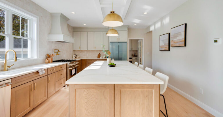
AFTER: We knocked down the wall to finally connect their kitchen and dining room. By adding the island we created more storage space and it also acted as a natural barrier between the two spaces. By having seating at the kitchen island they are now able to entertain while still holding conversations with their guests in their new open floor plan!
![]()
With the backsplash tile design, I wanted to stay true to the age of the home and classic white kitchen design that we were going for so the vintage feel of this blue crackled arabesque tile was a great way to add a pop of color.
![]()
More of my favorite details:
![]()
![]()
![]()
Loved this transformation? Check out the whole project walk through video HERE!
What To Read Next:
| From Starter Home to Forever Home: An Addition & A Wood Cabinet Kitchen Update
| Remodeling Kitchen Essentials
Looking For Design Tips? Read These Next:
| Fixer Upper Blue Paint Colors
| How Much Does A Bathroom Remodel Cost?
| Top 5 Best Neutral Paint Colors