
This family home was in immaculate condition before we started but it felt like an outdated time capsule from the 1960’s! Our clients felt they had enough square footage, but the outdated layout wasn’t working for their growing family, and they were ready for a new look. They wanted to focus on the majority of the first floor, which included a new kitchen with island seating, dining room, living room and renovating the bathroom.
PROJECT AT A GLANCE:
Location: Burlington, MA
Type of Home: Split-Entry Built In 1960
Square Footage: 2,404 Square Feet
BEFORE FLOOR PLAN: The kitchen was packing a lot into a small space and over the years this outdated layout became obsolete. The portable dishwasher was a pain, there was no seating in the kitchen, and the half wall to the dining room made the space feel even smaller. They had plenty of space for everything on their wish list, but the floor plan needed some reworking!
BEFORE KITCHEN & DINING ROOM: The wall oven chewed up valuable countertop space and the corner was wasted by the blind corner cabinet. Since there was no dishwasher, these homeowners were using up valuable square footage to store a portable unit. The dining room being right next to the kitchen was not a problem for this family and had some nice natural light coming in through the double windows. The big issue was the eye sore of a kitchen they had to look at, which was in desperate need of a new look!


BEFORE LIVING ROOM: The living room was a great size but did not work with our clients wish list item of having an ‘open floor plan’. The walls closing off the kitchen had to go in order to achieve everything they wanted, and the kids were so excited they drew on the walls to celebrate that they were coming down!

BEFORE BATHROOM: The bathroom was just down the hall from the rest of the rooms we were remodeling and shared a wall with the kitchen. This was a tight space with no storage solutions, countertop space, or moving room- which we all know does not work well with a growing family when everyone tries to pack into the bathroom in the morning!

AFTER FLOOR PLAN: Removing the walls gave us space for an island with seating and changed the entire look of the first floor! Now the family has an open layout that is functional and lets a ton of natural light flow from the front to the back of the home!


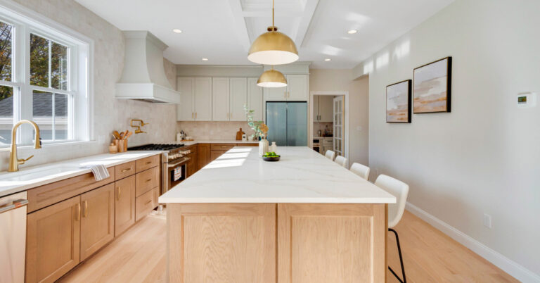
AFTER KITCHEN: Since the old kitchen was very dark, we wanted to keep the new look bright, clean and airy! Now, this white kitchen is the heart of the home with island seating, plenty of useable cabinet and countertop space, and a dish washer that was actually a part of the kitchen design! I wanted to make sure there was still some contrast and texture within the overall design, so I chose to incorporate a charcoal island, wavy subway tile as the backsplash, and black lantern pendants.
![]()
![]()
Some of my favorite details about this kitchen are the matte black accents! Creating contrast in an all-white kitchen design is important so everything doesn’t look flat. By using the black hardware, the black faucet from Kohler, and this adorable black pendant over the sink, I was able to bring enough interest to the cabinet walls without overpowering the clean new look of the kitchen.
![]()
The kitchen and dining room now have an abundance of natural light and flow seamlessly together in the new open floor plan.
![]()
![]()
BEFORE LIVING ROOM FIREPLACE: The outdated brick fireplace needed some TLC and I had a vision for what I wanted the new design to look like!

AFTER LIVING ROOM FIREPLACE: I knew I wanted to build the fireplace out into the living room, compared to just the flat brick wall, to give the room some dimension. The added details of the crown molding and the paneling give the fireplace surround a modern timeless look. Keeping a similar theme to the kitchen, I wanted to use another wavy subway tile with some color and incorporate black again by using a stunning black stone for the hearth.
![]()
An over-all shot of the final new open layout design!
![]()
BEFORE BATHROOM: The bathroom had little to no storage solutions which did not work for this family. The 1960’s yellow tile had to go, and I wanted to rework this layout in order to fully use the square footage they had to its best potential.

AFTER BATHROOM: Everything was moved in this bathroom in order to fully maximize the space! By moving the shower to the back wall, we were able to free up valuable walking space which was desperately lacking in this bathroom before. I wanted to continue with a clean white design to really brighten up the room, and I made sure to keep the window for natural light but made it much smaller for obvious privacy reasons. Wavy white subway tiles with a contrasting grout, charcoal cabinets, and classic quartz countertops finish off this new look!
![]()
One of the wish list items for this family was for a second space so someone would be able to get ready at the same time as another family member. By moving everything around, I was able to add a tall second cabinet with an outlet to act as another vanity!
![]()
![]()
BEFORE EXTERIOR: Since our clients now have a new look for their interior, they wanted to continue the transformation to the exterior! The front door to this 1960’s home was hidden and lacking some modern personality.

AFTER EXTERIOR: I wanted to continue the nice lines their pitched roof already made, which looked gorgeous over their bay window! By building out, I was able to add a gable roof and columns to frame the front door. Making the new exterior design elements white was a great way to create more emphasis on the front door. The white also breaks up the gray siding!
![]()

What To Read Next:
| From Starter Home to Forever Home: An Addition & A Wood Cabinet Kitchen Update
| Remodeling Kitchen Essentials
Looking For Design Tips? Read These Next:
| Fixer Upper Blue Paint Colors
| How Much Does A Bathroom Remodel Cost?
| Top 5 Best Neutral Paint Colors


2 Responses
I love the simple pendant light above the kitchen sink? Could you share where it is from? Thank you!!
Hi Chelsea! Unfortunately, that pendant light has been discontinued.