Paint is an easy and inexpensive way to make any space in your home feel brand new! Some of my go-to paint colors are from a tried-and-true brand, Sherwin Williams. Their Emerald Designer Edition paint line has over 200 new colors and I was completely blown away with their selection of bold paint colors. Using a darker color can be tricky, especially if you are unsure of where to use it.
One of the colors that caught my attention was Stargazer, which is a striking dark blue paint color. My mind immediately started to think of places that this color could truly shine! In this blog, I will discuss 3 spaces that you can use this paint color in. Whether you are looking to do a small room makeover, or redo an entire space, this color is a great choice to add some personality to your home!
P.S: You can pin the following design selections to Pinterest; toggle your mouse over the top left corner of the image to see the red and white ‘P’ pop up and then simply click on it!


MUDROOM:
A great place to incorporate a bold color is in a mudroom! Specifically, for Stargazer, this pretty blue paint color would contrast perfectly with a lighter flooring and brushed gold hardware. The best way to offset a dark color is to thoughtfully choose selections, like tile and hardware, that are not too busy. Everything surrounding the color should accent the paint, not compete with it.

BEDROOM:
For those who love their bedrooms to be on the darker side, Stargazer is a great choice. This blue paint color looks best with dark hardwood flooring, and whites or greiges for curtains, linens, and rugs. Adding brushed gold or nickel finishes will bring some shine to the final look. You can use this on all four walls, but if that is too much for you, try an accent wall! Accent walls are an amazing way to add a pop of color and personality to a space.
PAINTING TIP: When painting any space, the color will ALWAYS be a little lighter than when it dries. Don’t panic when you open a can of paint and it doesn’t look like the color that you picked. Take a small tester home and paint it on a wall to see what it looks like first so you can see the difference.

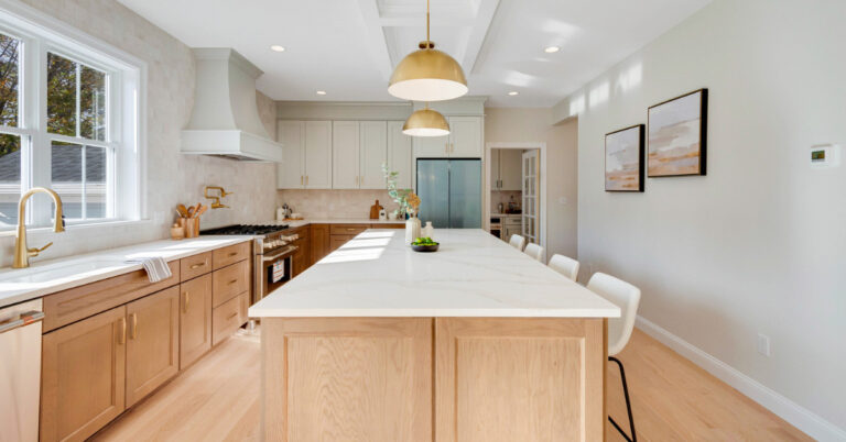
KITCHEN ISLAND:
Dark blue colors look absolutely stunning on kitchen islands paired with white cabinets. Similarly, to the other two spaces I previously talked about, a dark hardwood flooring and whites or greige tones would still work really well in a kitchen design. You can have fun with your selections in this space because the color is used as an accent. You can compliment this space with either a patterned or textured backsplash tile and incorporating cool pendant lighting to tie the final design together.

What To Read Next:
| Navy Blue Inspired New Build
| Run Down Tear Down Goes Ultra Modern