Every year Sherwin Williams comes out with their color forecast showcasing their picks for the next year, which in this case is 2021! Sherwin Williams Colormix® Forecast for 2021, Rhythm of Color, features 4 color palettes with 10 paint colors in each palette. The palettes are Sanctuary, Encounter, Continuum, and Tapestry! From neutral paint colors to bold blues and funky pops of color, Sherwin Williams thought of it all.
I chose 5 gorgeous colors from each group that I would see myself using in the upcoming year. I gravitated towards paint colors I would typically use like soft blues, greens, and some pops of color to create my own ‘favorites’ palettes for you guys at home to be inspired by! Check out all of the paint palettes from the Colormix® Forecast and my favorite paint colors below.
P.S: You can pin ALL of these design guides to Pinterest; toggle your mouse over the top left corner of the image to see the red and white ‘P’ pop up and then simply click on it!


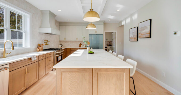
From the Sanctuary paint color palette, I chose earthy tones that would be perfect for someone who is not into bold colors. My favorite neutrals from this palette are Morris Room Grey, Modern Gray, and Pearl Gray. If you are looking for more color, Messenger Bag is a great option for a kitchen island and Urbane Bronze is pretty for a moody mudroom color.
P.S. Urbane Bronze is Sherwin Williams Color of the Year for 2021!


Encounter’s palette had a lot more darker colors, which I loved! It reminded me of the perfect Fall paint color palette because of its earthy tones mixed with a little bit of burgundy, orange, and yellow. The colors I was inspired by were Naval, Juiblee, Rosemary, and Hardware. I wanted to throw in a fun color that I thought would be awesome to use in a smaller space, like a half bathroom or even an accent wall. Tarnished Trumpet is a stunning yellow that is bright, but still muted from the gray undertones.


This palette, Continuum, is beautiful with its array of blue-jewel tones mixed with a few unexpected paint colors. The colors I chose from this paint palette were Crushed Ice, Cyberspace, Novel Lilac, Commodore, and Wishful Blue. These 5 colors feature 2 dark paint colors, a light blue, the perfect greige, and of course a vibrant color.


I would consider Tapestry to be the multicolored paint palette compared to the other three. This palette features so many great flashy colors, my favorites are Cape Verde, Embellished Blue, Greek Villa, Perfect Periwinkle, and Aleutian. It’s no surprise that I leaned towards the blues and greens, but those are always my go-to colors!


Calling all Renovation Junkies! Get your home reno fix by watching something new!
The first 5 episodes of Renovation Rekindle are now available to Stream for FREE from your favorite devices!
CLICK HERE FOR MORE INFO
What To Read Next:
| Navy Blue Inspired New Build
| Small Master Bathroom Gets A New Layout
| Ranch Style Dream House Tour
Looking For Design Tips? Read These Next:
| Sherwin Williams Whole House Paint Colors
| Design Tips On Using Farmhouse Style Patterned Tile In Your Home