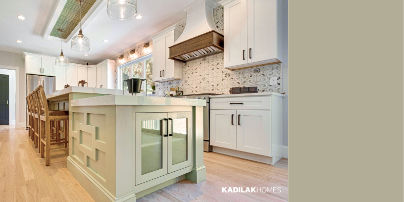

9 kitchen design trends people are asking for in 2026. From statement range hoods to walk-in pantries, Kadilak Homes shares 9 kitchen design trends we’re building in 2026 across Burlington, Lexington, and Greater Boston, MA.

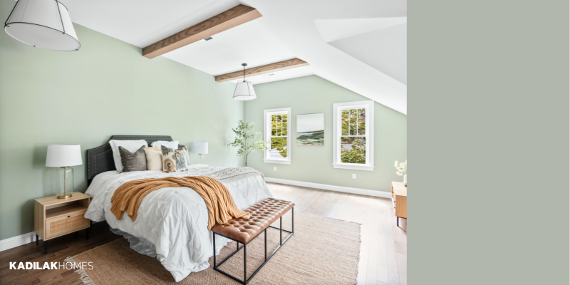
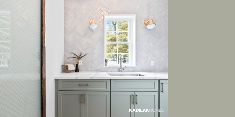
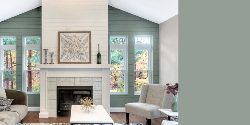
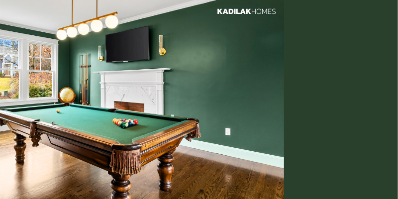
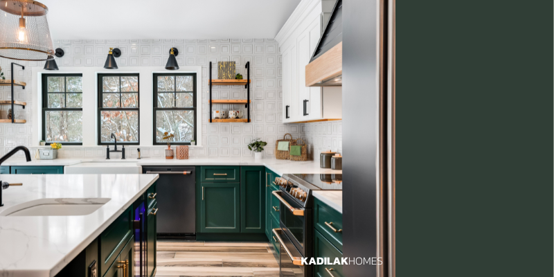
Over the past few years, we’ve seen a shift away from the cool blue gray shades that defined the 2010s, as homeowners started leaning into

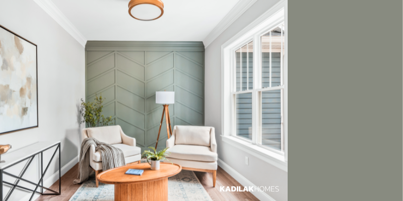
What paint colors are trending in 2026? We rounded up all of the shades that are predicted to be big in interior design, and the

Powder room and bathroom design ideas to elevate your home, maximize your space, and experiment with bold colors and patterns.

When it comes to designing a kitchen or bathroom, hardware might seem like a small detail, but it’s one of the easiest ways to elevate

Hosting Thanksgiving is stressful enough, so the last thing you should worry about is putting together a table setting! We designed 3 different tablescapes, and